 |
| The Logo and the Arms |
| The University of Tasmania's logo, used on its stationery and web sites, is based on a standardized and stylised version of its Arms and its Motto. In this article I briefly document the history of the Arms, and of this representation. [This is a rather long page to read on-screen. You might want to print it to read at leisure if you have a color printer.] |
| Lead-up to the Arms |
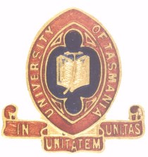
| From 1897 the University used a Common Seal that was the seal of the Tasmanian Council of Education (established 1859) whose functions it had taken over on its establishment in 1890. On 19 March 1901, the surrounding words 'Council of Education' were replaced by 'University of Tasmania Common Seal 1890'. The seal design was used on letterheads and official documents (and still is on the latter). I cannot display a copy of the Common Seal (made as indentations in paper or sealing wax) for security reasons. However, a similar badge was also used in these times by the Tasmania University Union (shown below), with the addition of a still-used punning pseudo-motto 'In unitatem Uni.Tas' = 'In unity, Uni[versity of] Tas[mania]' or 'Unity in unity', and the omission of the text 'Common Seal 1890', a star at the top and a rose below from the Seal. The University seems to like this multi-lingual pun, also using 'UNITAS' (as Latin = unity) as the title of its in-house newspaper distributed to staff fortnightly. |
|
| With growing aspirations, in 1936 the University Council decided to break from this usage and to find itself a 'Coat of Arms'. It appointed a working party. The working party arranged for a design competition from graduates with a prize of 5 guineas (£5-5-0) closing on 30 April 1937. A design by "Chad", aka Mr Egbert Holder Harry BA BCom Launceston resident, was declared the winner from 47 submissions. The brief minutes of the meeting are a model for later generations to emulate. The documentation is in the Tasmanian Archives file UT47/185. |
| Mr Harry's design was a rough sketch, with a shield divided into silver (=white) and blue quarters. The quarters bore the following charges: |
| a red Lion passant being 'the Tasmanian badge' [see Notes] |
| a gold book signifying 'the academic side of University activity' |
| a gold Southern Cross 'representative of Australia' |
| a red Olympic torch 'representing the athletic side of University activity' |
| Mr Harry's original pen-and-ink sketch does not reproduce well when reduced; here is a thumbnail in color, which is also a hyperlink to an actual-size reproduction of the sketch. |
 |
| Mr Harry evidently knew something about heraldry because the quarters (silver and blue) and the charges on them (red on the silver, and gold on the blue) comply with the heraldic rules of mixing colors and metals, and he knew the heraldic conventions for depicting colors in b&w (eg horizontal hatching lines for blue, vertical for red). |
| The working party had been given the name of a UK designer for the Royal Mint, Mr George Kruger Gray, by the University of Western Australia, and also approached the College of Heralds. It was horrified at the price of £130 it was given by the Lancaster Herald. Mr Kruger Gray often painted the official Grants of Arms on vellum when they had been registered by the College of Heralds and provided a price of £40 to draw up something for the colonials. The Council had the impression that the University might be the 'only one in the British Empire without Arms'. The Council approved the project on 25 June 1937, asking for the chosen motto to be included, but Mr Harry's crest to be omitted (a wreath of unknown colors surmounted by a gold coronet and above that a 'castle' looking more like a Tower of Babel), thankfully because it was an inconsistent mischmasch. The Registrar, Mr AS Preshaw, fudged the Olympic torch in a surviving letter, describing it as a 'an indication that the University was carrying the traditions of scholarship through the centuries'. |
| Mr Gray took a look at the design and candidly said it was heraldically hopeless, but he could do something that kept the emblems that the University desired. In due course he produced a beautifully painted drawing that looks much like the logo in use today. However, the drawing had to be sent back to have the motto added. The University was delighted, paid up, and began to use the design everywhere. |
 |
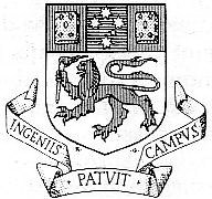
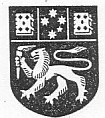
| As artist, Mr Gray signed his initials *K* and *G* on the drawing, as you can see just under the shield. Curiously, as the design was redrawn and repainted over the years, other artists copied the signature initials, unaware they were thereby committing a fraud. [The b&w example shown below appears on various documents I have from 1974 to 1993. The hatching and stippling are heraldic conventions for the colors red, blue and gold for interchange purposes in b&w heraldic record books, and not meant for public use. The lion has always been somewhat emaciated compared to those I remember from Africa.] |
 |
| At this time and for some time to come, the University's correspondence was carried out on black-and-white letterhead, for printing cost reasons. The full color Arms were reserved for degree certificates and similar prestigious uses. Common occurrence of the full color arms waited until the coming of lower cost color printing processes, and then of course computers with color screens, the Internet, and the WWW. |
| The University made another enquiry about registering the Arms in 1971, when the price had risen to £400. No action ensued. The situation stayed like this until the vice-chancellorship of Sir George Cartland. Sir George was a personal friend of the then York Herald of Arms, Dr Conrad Swan, and determined to try to get the University's logo matriculated (registered) by the College of Heralds. This was a tricky task, for usually an applicant gets whatever design the Heralds can come up with, consonant with general suggestions. The funds were found in 1977 (more by now, £780) and an application made. |
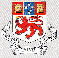
| In due course the College wrote back and said that they were able to grant the University something very close to its old unregistered logo, except for one thing. The superimposition of blue on the red chief (top bar) of the shield was contrary to the rules of heraldry. 'Colors' such as blue and red cannot be directly superimposed. But by putting a yellow/gold border down the two sides of the blue bar with the Southern Cross, this would be avoided. The red and blue would be separated by gold (a 'Metal', not a 'Color'). This Grant of Arms was made in 1978, and for the first time the University had Arms. |
| The blazon |
| The blazon (textual description) of a Grant of Arms is the official definition of the Arms. Any picture that meets the blazon requirements is acceptable, allowing for the owner to use distortion, different artists at different times, and updating of representations. The colors are only broadly described. Monochrome (for example black-and-white) versions are of course allowed, when the colors become redundant. |
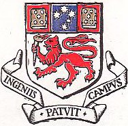
| The blazon for the University's shield (from the Grant of Arms) is as follows: |
| Argent a Lion passant Gules armed and langued Azure holding in the dexter paw a Torch enflamed proper on a Chief Gules a Pale Azure fimbriated Or charged with a representation of the constellation of the Southern Cross Argent between two closed Books clasped Or. |
| This is heraldic language, with bits of Old French thrown in (for example argent, or, passant, gules) and a stylistic convention for structure, very much like a computer language. Here is what it means in English with substructure shown by indentation. White and silver are equivalent, as are yellow and gold. |
| A white/silver shield |
| on which is a red lion walking across facing straight ahead with right forepaw raised |
| with blue claws and tongue, |
| holding in its right forepaw a flaming torch in natural colors; |
| and on the shield is also a broad red bar making up the top one-third |
| on which is a broad central blue vertical bar with a yellow/gold border down each side, |
| carrying the [five] brightest stars of the Southern Cross in white/silver; |
| between two yellow/gold books closed with clasps. |
| The books |
| At last check, the University of Tasmania is the only university in Australia to have closed books on its logo/shield. About 50% of Australian universities have books on their logos, and all of the others are open books. |
| In 1937, this was of concern to the University because Mr Harry had drawn an open book in his sketch, and an open book was on the Seal. However, Mr Gray (the artist) said that it did not matter; Oxford had one and Cambridge the other; and that if anything one meant learning and the other knowledge. There was not sufficient room on the Chief for two open books. |
| Motto |
| The motto does not form part of the Grant of Arms. Anyone can choose a motto, and there is no exclusive right to a motto. The motto was suggested by the University's first Registrar, Lt-Col JHR Cruikshank, allegedly from 'some dictionary of quotations'. Professor RL Dunbabin ensured it was officially adopted in 1937. |
| The scroll shape bearing the motto is the one used in 1937, and also has no special merit or protection in heraldry. As a matter of interest, two schools in the world have a related motto (the approved translations given by the schools are in parentheses): Cedarbrae Collegiate Institute (Toronto, Canada) Hic patet ingeniis campus (Here is a place where you can develop your talents) and Marr College (Troon, Scotland) also Hic patet ingeniis campus (Here lies a field open to the talents). |
| The supposed 'Crest' |
| The University does not have a crest. It does not have supporters, badges, nor any of the other more fancy bits of heraldic Arms. It only has a shield (or escutcheon) in its Grant of Arms. A crest is an ornament for the top of a jousting helmet in case you drop the shield that otherwise identifies you inside the armor, and people who do have them in their Grant of Arms sometimes use them as badges instead of the usually more fussy shield. Corporations are seldom granted crests because they are not real persons and don't have heads on which helmets can be worn. States have Governors or some other kind of monarchical rulers so they are an exception. |
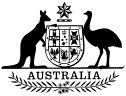
| Roosters and sulphur-crested cockatoos have crests. The British Prince of Wales has a crest (a crowned lion statant guardant standing on a larger crown) and the Commonwealth of Australia has too (b&w Arms shown below with the word Australia and Acacia twigs; the crest is a gold seven-pointed Commonwealth Star above a twisted gold and blue wreath). Think about the Governor-General wearing it on his/her hat. Australia does not have a motto. The word Australia and the Acacia sprigs do not have heraldic approval but have always been used as decorations. |
 |
| People who talk about the University's crest are abusing the word and should check a dictionary. |
| The University's practices |
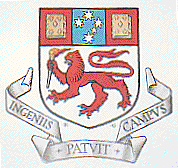
| Strangely, once the University gained its Arms in 1978, it took almost no notice of the Grant. Though the old design was required to be updated slightly, it has hardly ever been. The only correct pictorial versions of the Arms now extant [July 2001] may be the one in the Grant of Arms, and a couple of relief sculptures on buildings of the 1980s. This Web page increases that number significantly! The logo on the University's cars does not conform to the Grant of Arms, nor do any of the versions on the website, the letterhead, most of the the buildings, or the campus signage. |
| The pre-matriculation design keeps being revived. It is hard to account for this, since except on business cards there is ample room to render the shield correctly (see sidebar for a fairly small example at low resolution). However, let us take a closer look at the University's practices. |
| During David Caro's vice-chancellorship several modernized b&w versions of the Arms were briefly approved for and used on stationery, but they were never very popular and old stationery continued to be used alongside them by the traditionalists. The motivation for the change was that the old representation was too fussy for modern tastes. |
  |
| During Professor Lazenby's vice-chancellorship up to the end of 1990, the University dropped the Arms from its stationery, and substituted the design facetiously known as the 'capsized yacht'. This logo was even less fussy and more modern than the Caro Arms, and reproduced well in black and white and in small sizes. The reason was the same as mentioned above. It put a stylized red lion and its torch from the Arms on top and a gray Tasmania-shaped triangle with a white T running through it underneath (Tasmania x 3 if you did not get the message). The full Arms were reserved for degree certificates, ceremonial functions and signage only. |
 |
| A strange version appeared on the 1988 Graduation booklets, strange because it left space for the gold borders along the blue Pale but did not have them, and omitted the red background of the Chief. The Lion sported his blue claws and tongue, which was correct but rare. I suspect that this was a printer's mistake on the covers, noticed too late to reprint (or someone thought it would pass). I did not see it again. |
 |
| However, for the Centenary celebrations in 1990, one of the few correct versions of the Arms to have been produced was used on the covers of the printed programs for the Concert, Graduations, etc. |
| When the University (at Hobart) and the Tasmanian State Institute of Technology (at Launceston) amalgamated in 1991, the existing logos of both institutions were dropped, but it was agreed to keep the name University of Tasmania. The Grant of Arms carried forward as the new institution was legal successor to both its predecessors, and the Arms again became the basis for the University's logo. (Someone other than I will have to write about the history of the TSIT logo.) |
| During Alan Gilbert's vice-chancellorship the Arms were redrawn (the 'new university' effect again) and deliberately made to look artistic and roughly sketched, to denote modernity. The words 'UNIVERSITY OF TASMANIA' in caps were added underneath (not shown) to constitute the full logo, and a Visual Standards Manual was created. |
 |
| When Don McNicol became VC, he had the logo taken back to what was described as a 'cleaner version' of the Arms (in other words it looked as though it was done by a draughtsman rather than an artist). See the side-bar for the 2001 Web home page version. It is interesting to realize that every one of the last five Vice-Chancellors has presided over or made changes to the University's logo! In 2001, the words underneath were changed to a more compact arrangement: |
| UNIVERSITY |
| OF TASMANIA |
| Also in 2001, the Council established its own website within the University's Internet domain utas.edu.au, and used a photograph of the Arms and Motto in a bronze medallion as its identifying badge, with the words University of Tasmania moved to the top due to space constraints. |
 |
| The Arms and the Motto have influenced the University's logo since 1937. I call it a logo (or a service mark), because that is what it is. It is a stylised design used to denote the University, and deviation from the standard version is frowned upon, if not enforced. This extends to the exact proportions and colors of the logo, the shape of the scroll carrying the motto, the irrelevant embossed diamonds and crosses on the books, and many other features. In contrast the rules of heraldry are much more free: any representation that meets the blazon requirements is allowed. (Though as I have noted, the University's logo usually does not meet the heraldic requirements of its Grant of Arms.) |
| Blue & Red (or Gold, Black & Red; or Blue & Gold) |
| The Arms have a lot of red, white and blue, and a little gold (leaving out the torch in its naturalistic colors, and no black). The University at one stage went quite overboard in adopting the blue and red theme for painting buildings such as the University Centre at Hobart and the Centre for the Arts in Hunter Street. Probably, it is still true to say that blue and red are the University colors most staff would recognize in 2001. However in a document dated 1997, the University colors are cited as gold, black and red (I have no reference to a Council decision). In 1928, the University's sporting teams used blue and gold as the University colors. If anyone has information on an official University determination, please let me know with the details. |
| Legal protection |
| The Arms are matriculated with the College of Heralds, but this gives them no protection in Australia. No decision by the Court of Chivalry in the United Kingdom would have any effect in Australia, nor is it likely that any Australian court would accept a case based solely on the law of chivalry. Australia has been a totally independent nation (apart from the shared monarch) since the Statute of Westminster Adoption Act 1942 and the Australia Act 1986. I am sure that even the direct appointment of the heralds by the monarch and the single hereditary judge (the Earl Marshal of England) would make no difference. Not to mention the total disgust of the Australian public if such a case were to be mounted. |
| The protection of the University's logo therefore rests on two sets of Australian legislation: |
| trademark law, provided the logo and its components are registered as service marks (the equivalent of a trademark for a service provider rather than a goods provider), and |
| consumer protection whereby an unauthorized use may be deemed to be 'passing off' to gain a financial advantage or to deceive (expensive to prove by itself, if say a nearby shop calling itself the University Sandwich Bar started displaying the logo or Arms). |
| Following my recommendation, the University registered its logo consisting of the Arms and Motto as a trademark effective for ten years from 11 December 1997 (TM #750726), thereby giving the logo protection against misuse in Australia. |
| Acknowledgment |
| Cathy Fyfe helped enormously in retrieving obscure documents from the University records and the State Archives so I could scan some of these pictures and check my recollections. |
| Notes on the Tasmanian Badge |
| On 7 August 1869, Queen Victoria ordered colonial governors to fly a Union Flag with the badge of the colony in the centre; the proclamation went on to say 'the distinguishing flag for vessels belonging to or permanently employed by the Government of Tasmania shall be a Blue Ensign with a Lion "Passant" red on a white shield in the fly'. "Passant" = walking with three paws on the ground and the right forepaw raised; the mysterious and unnecessary quotation marks are usually included in the description of the flag. This flag came into use as representing the State, and on 3 December 1975 the Governor issued another proclamation recognizing this flag as the State Flag and authorizing its use by the general public. |
| However, in the Royal Warrant granting Tasmania its Arms in 1917 there is a similar lion forming part of the crest, which is described as a Lion statant (standing usually with all four paws on the ground). Perhaps the Lion in the Tasmanian Arms cannot walk while balancing a crossed spade and pick-axe. The Royal Warrant grants Tasmania a shield, a crest and supporters. Badges are not usually included in Grants of Arms. |
| Update |
| On 5 September 2001 the University updated its website. While using a new version of the logo, it still does not conform to the Grant of Arms. The new web image (shown below) is also extraordinarily fuzzy and of poor quality. I hope it is improved soon. |
 |
| © Copyright 2001 AHJ Sale |
| Page published 2001 August, last modified on 2001 September 9 |